Personal Brand
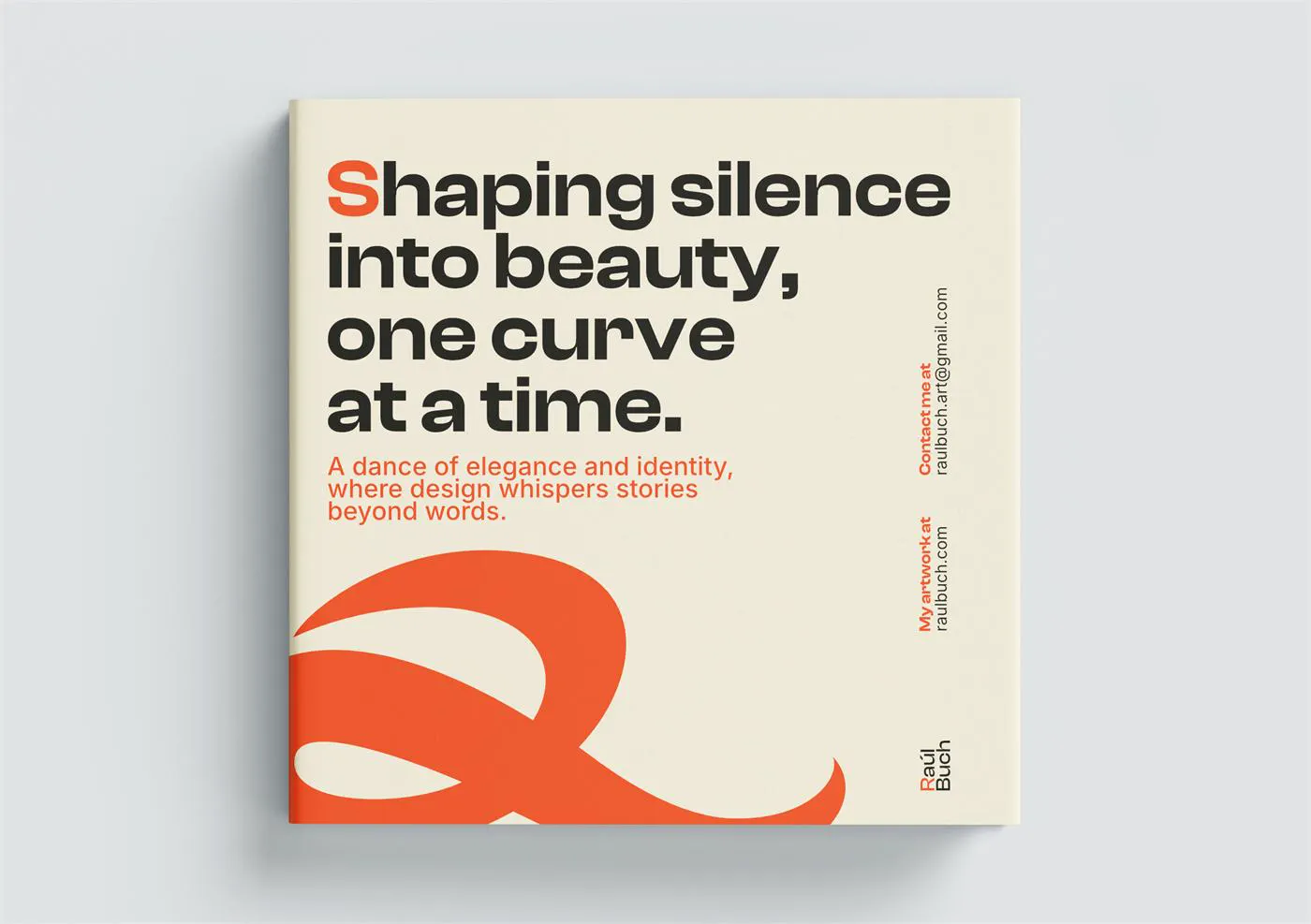
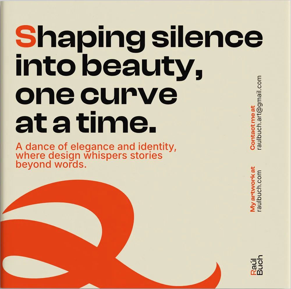
My own identity: an R born from my signature, a sober palette with touches of colour and a typeface with character, applied to stationery, editorial and digital presence.
- Project
- Own identity
- Typefaces
- Clash Display · Inter
- Claim
- Creative mindset
The challenge
I wanted a brand that would let me express myself as an artist while conveying judgment and quality, with a current style that works across very different projects.
The symbol
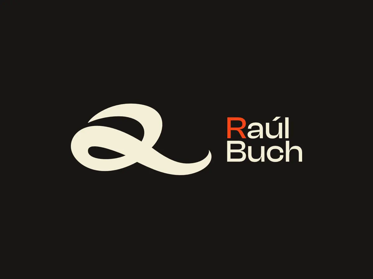
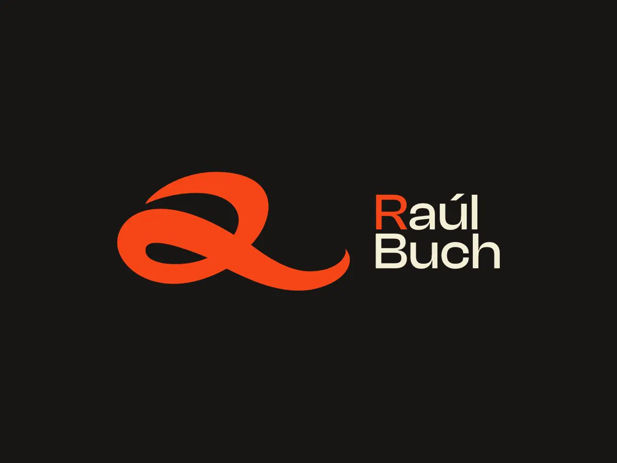
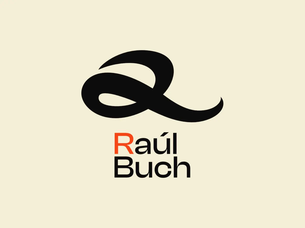
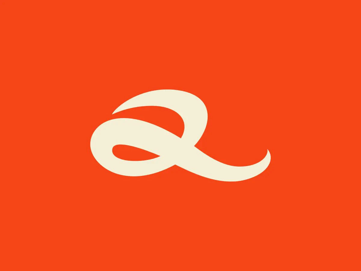
The R comes from my signature: I have always signed “Raúl” with that calligraphy. I redrew it as if it were a brushstroke until I had a clean, continuous shape that’s easy to recognise.
The system
A sober black base with touches of colour, like the void of space and its constellations. Clash Display subtly narrows at key points and feels hand-crafted, just like the calligraphy.
A bold brand that never leaves you indifferent: a creative mind, a mindset for imagining infinite possibilities.
The symbol
Colour and typography
Ink Black#0C0C0C
Soft Linen#F5EED6
Creative Ember#F64517
AaClash DisplaySemibold · RegularHeadlines and brand
AaInterMediumBody and reading
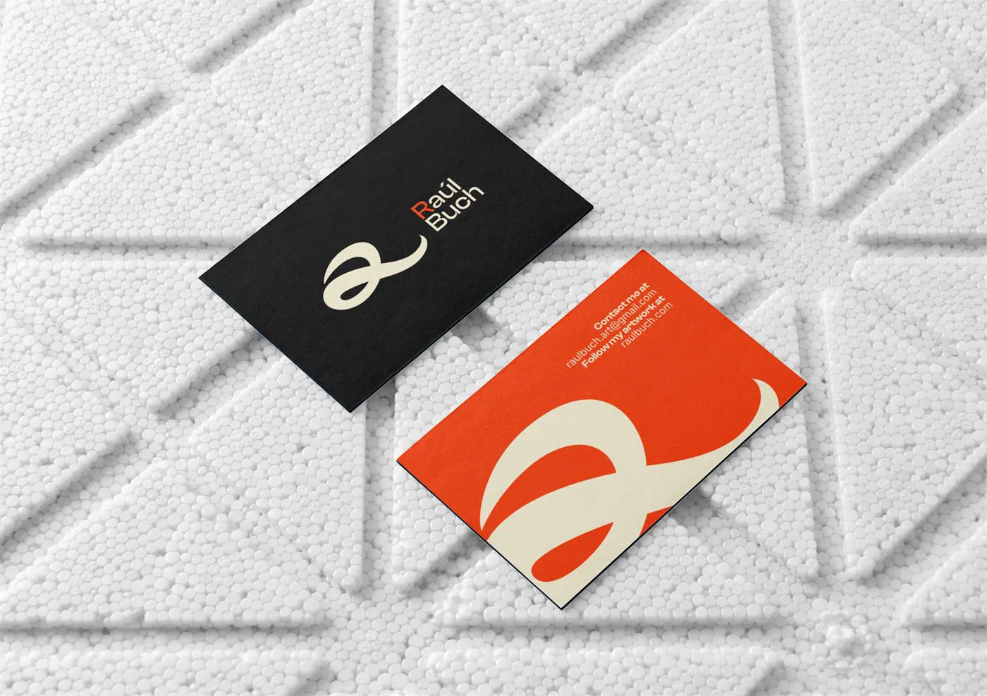
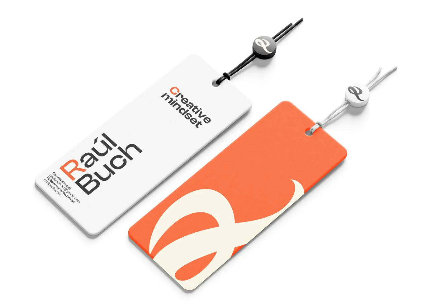
Applications
Digital presence